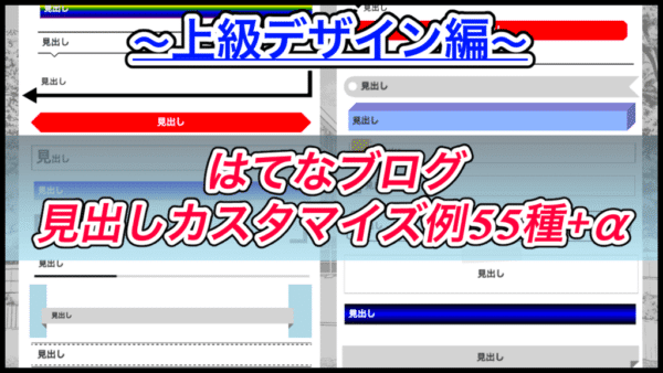
前回、はてなブログの見出しカスタマイズ例を紹介しました。
そこで紹介したのはシンプルなデザインだったのですが、今回はちょっと手の込んだカスタマイズをする「ちょっと上級編」です。
基本的にコピペでも使えるので試してみてください。
もくじ
- 1 はじめに
- 2 グラデーションを使った見出し
- 3 3色グラデーション
- 4 7色グラデーション
- 5 色を繰り返す
- 6 グラデーションを繰り返す(逆)
- 7 グラデーションを繰り返す(縦)
- 8 背景+リボン(下向き)
- 9 背景+リボン(上向き)
- 10 ラベル風(横向き)
- 11 ラベル風(横向き+穴あき)
- 12 左側にラベル(縦向き)
- 13 垂れ幕風ラベル(縦向き)
- 14 蛍光ペン風
- 15 アンダーライン(毛糸風)
- 16 2種類のアンダーライン(通常+点線)
- 17 2種類のアンダーライン(濃色 -> 淡色)
- 18 アンダーライン+四角x2
- 19 塗りつぶした四角x2
- 20 枠線+影
- 21 枠線+内側に影
- 22 2色の枠線
- 23 丸型の吹き出し
- 24 枠線+矢印
- 25 テキストに影を付ける
- 26 テキストが浮き出る見出し
- 27 見出しの先頭にテキスト
- 28 先頭にチェックボックス風
- 29 キューブ型(直方体)
- 30 枠線+歪み
- 31 星っぽいデザイン
- 32 ページめくり風(右下)
- 33 ページめくり風(右上)
- 34 張り紙風見出し
- 35 紙風見出し(影付き)
- 36 かっこ風見出し
- 37 おまけ
- 38 見出しの枠線に沿って丸が移動する
- 39 動くアンダーライン
- 40 尻尾っぽい見出し
- 41 見出しがガタガタ揺れる
- 42 かっこが開いたり閉じたり
- 43 まとめ
はじめに
前回の「シンプルデザイン編」でも話しましたが、はてなブログの見出しをカスタマイズする場合、テーマや書き方について注意点が幾つかありました。
準備編・シンプルデザイン編をまだ確認していない方は、先に確認しておくようにしましょう。
【はてなブログ】cssの見出しカスタマイズ例50種+α!準備編
【はてなブログ】cssの見出しカスタマイズ例50種+α!シンプルデザイン編
【はてなブログ】cssの見出しカスタマイズ例55種+α!上級デザイン編
作成した見出し一覧:
では早速ですが、今回の見出しカスタマイズ例を見ていきましょう。
グラデーションを使った見出し
見出しの背景にグラデーションがかかったデザインにしてみました。

.entry-content h2{
  padding: 10px;
  color: white;
  background: linear-gradient(blue, lightblue);
}
色の設定は( 上部分 , 下部分 )になっています。今回の場合は「青->水色」ですね。
環境に合わせてこの色を変更してみてください。
3色グラデーション
グラデーションに使う色を「3色」にしてみました。
先ほどと同じように色を設定していきます。
ここでは、黒 -> 青 -> 黒で設定しました。

.entry-content h2{
  color: white;
  padding: 10px;
  border: 0;
  background: linear-gradient(black, blue, black);
}
7色グラデーション
cssのlinear-gradiantは、どんどん色を追加していくことができます。
そこで7色を使って虹色の見出しにしてみました。

.entry-content h2{
  padding: 10px;
  border: 0;
  color: white;
  text-shadow: 0 0 3px black;
  background: linear-gradient(red, orange, yellow, green, blue, darkblue, purple);
}
ちなみに、本来の虹色は「赤橙黄緑青藍紫」の順に7色らしいのですが、cssで藍色を指定する「indigo」の色味が気に入らなかったため、darkblueにしてあります。
色を繰り返す
表現がわかりづらいですが、グラデーションを繰り返しているようなイメージです。

.entry-content h2{
  padding: 10px;
  border: 1px solid #adadad;
  background: repeating-linear-gradient(-45deg, lightyellow, lightyellow 5px, lightgreen 5px, lightgreen 10px);
}
配色は通常のグラデーション同様自由に設定できるのですが、幅の設定がちょっとわかりづらいです。
こんな感じで設定してあります。
ですので、2色目だけ幅を広くするというような使い方もできるので、環境に合わせてカスタマイズしてみてください。

※(-45deg, lightyellow, lightyellow 5px, lightgreen 5px, lightgreen 30px)
グラデーションを繰り返す(逆)
グラデーションの角度を「逆方向」に設定する事もできます。
先ほどは-45度で設定していましたが、これを45度にしました。

.entry-content h2:nth-child(30){
  padding: 10px;
  border: 1px solid #adadad;
  background: repeating-linear-gradient(45deg, lightyellow, lightyellow 5px, lightgreen 5px, lightgreen 10px);
}
グラデーションを繰り返す(縦)
先ほどと同じようなグラデーションを、縦方向に繰り返す事もできます。

.entry-content h2:nth-child(31){
  padding: 10px;
  border: 0;
  text-align: center;
  background: repeating-linear-gradient(90deg, lightyellow, lightgreen 25px, transparent 25px, transparent 35px);
}
背景+リボン(下向き)
下向きにリボンがついた見出しを作成しました。
margin(余白)の値を調整して記事内の横幅と合わせると、よりそれっぽいデザインになるかと思います。


このような感じですね。環境に合わせて調整してみてください。
.entry-content h2{
  padding: 10px 30px;
  position: relative;
  border: 0;
  margin-left: -40px;
  margin-right: -40px;
  margin-bottom: 30px;
  background-color: lightgray;
}
.entry-content h2:before,
.entry-content h2:after{
  content: "";
  position: absolute;
  border: 8px solid transparent;
  top: 100%;
}
.entry-content h2:before{
  border-top-color: gray;
  border-right-color: gray;
  left: 0;
}
.entry-content h2:after{
  border-top-color: gray;
  border-left-color: gray;
  right: 0;
}
デフォルトのテーマの場合、左右に「-40px」ずつ余白を追加することで、背景のサイズに合わせることができました。
背景+リボン(上向き)
先ほどと同じようなデザインなのですが、今度はリボンを上に向けて設置してみました。
こちらも横幅を広げるとより良くなりますね。

.entry-content h2{
  padding: 10px 30px;
  position: relative;
  border: 0;
  margin-left: -40px;
  margin-right: -40px;
  margin-top: 30px;
  background-color: lightgray;
}
.entry-content h2:nth-child(21):before,
.entry-content h2:nth-child(21):after{
  content: "";
  position: absolute;
  border: 8px solid transparent;
  bottom: 100%;
}
.entry-content h2:nth-child(21):before{
  border-bottom-color: gray;
  border-right-color: gray;
  left: 0;
}
.entry-content h2:nth-child(21):after{
  border-bottom-color: gray;
  border-left-color: gray;
  right: 0;
}
ラベル風(横向き)
自分で作っておいて、この形なんて名前なの?
ってなった時に全然思い浮かばなかったので「ラベル風」って事にしました。

.entry-content h2:nth-child(22){
  background-color: lightgray;
  border: 0;
  position: relative;
  border-top-left-radius: 50pt;
  border-bottom-left-radius: 50pt;
  padding: 10px 30px;
  line-height: 30px;
}
.entry-content h2:nth-child(22):before{
  content: "";
  position: absolute;
  border: 25px solid transparent;
  border-right-color: white;
  right: 0;
  top: 0;
  bottom: 0;
}
ちなみに、残念ながらこちらのデザインは、複数行に渡るテキストに対応していません。
ラベル風(横向き+穴あき)
先ほどのラベル風デザインの見出しに穴を開けてみました。左側に穴を開けるだけで雰囲気変わりますよね。

.entry-content h2:nth-child(23){
  background-color: lightgray;
  border: 0;
  position: relative;
  border-top-left-radius: 50pt;
  border-bottom-left-radius: 50pt;
  padding: 10px 30px 10px 40px;
  line-height: 30px;
}
.entry-content h2:nth-child(23):before,
.entry-content h2:nth-child(23):after{
  content: "";
  position: absolute;
}
.entry-content h2:nth-child(23):before{
  border: 25px solid transparent;
  border-right-color: white;
  right: 0;
  top: 0;
  bottom: 0;
}
.entry-content h2:nth-child(23):after{
  width: 20px;
  height: 20px;
  top: 13px;
  left: 10px;
  background-color: white;
  border: 1px solid silver;
  border-radius: 50pt;
}
こちらも複数行になるとレイアウトが崩れてしまうため注意してください。
左側にラベル(縦向き)
今度は左側に、先ほどと同じようなラベルを設置してみました。

.entry-content h2:nth-child(24){
  position: relative;
  padding: 10px;
  padding-left: 70px;
  border: 1px solid black;
}
.entry-content h2:nth-child(24):before{
  content: "";
  position: absolute;
  border-top: 50px solid orange;
  border-right: 20px solid orange;
  border-left: 20px solid orange;
  border-bottom: 20px solid transparent;
  top: -10px;
  bottom: -10px;
  left: 5px;
}
垂れ幕風ラベル(縦向き)
ラベルシリーズの最後です。
最後のラベルは左側に表示させたもので、後ろ側から垂れ幕になっているっぽいデザインにしました。

.entry-content h2:nth-child(24){
  position: relative;
  padding: 10px;
  padding-left: 70px;
  border: 1px solid black;
}
.entry-content h2:nth-child(24):before{
  content: "";
  position: absolute;
  width: 10px;
  height: 8px;
  border-top-right-radius: 50pt;
  background-color: lightgray;
  border: 1px solid orange;
  border-bottom: 0;
  left: 41px;
  top: -10px;
}
.entry-content h2:nth-child(24):after{
  content: "";
  position: absolute;
  border-top: 50px solid orange;
  border-right: 20px solid orange;
  border-left: 20px solid orange;
  border-bottom: 20px solid transparent;
  border-top-left-radius: 5pt;
  top: -10px;
  bottom: -10px;
  left: 5px;
}
縦向きのラベルデザインに似ていますが、後ろ側から回り込んできているように見えませんか?
蛍光ペン風
見出しを「蛍光ペンでマーカーを引いたようなデザイン」に変更させました。

.entry-content h2{
  border: 0;
  padding: 10px;
  padding-bottom: 0;
  position: relative;
  z-index: 1;
}
.entry-content h2:before{
  content: "";
  position: absolute;;
  width: 100%;
  height: 15px;
  bottom: 0;
  left: 0;
  background-color: lightgreen;
  z-index: -1;
}
アンダーライン(毛糸風)
アンダーラインにグラデーションをかける事で、2色の毛糸のような下線を表示させました。

.entry-content h2{
  border: 0;
  padding: 10px;
  position: relative;
  line-height: 35px;
}
.entry-content h2:before{
  content: "";
  position: absolute;
  width: 100%;
  height: 10px;
  background: repeating-linear-gradient(-45deg, yellow, yellow 5px, lightgreen 5px, lightgreen 10px);
  bottom: 0;
  left: 0;
  border-radius: 50pt 10pt 50pt 10pt;
}
ちなみにこちらの直線は、実は左右の角を丸めています。
グラデーションをかけた事でちょっとわかりづらくなっちゃいましたけどね。
2種類のアンダーライン(通常+点線)
見出し内のテキストにアンダーラインをつけ、さらにそのアンダーラインを2種類のデザインに変更してみました。

.entry-content h2{
  border: 0;
  padding: 10px;
  line-height: 35px;
  border-bottom: 5px dotted black;
  position: relative;
}
.entry-content h2:before{
  content: "";
  position: absolute;
  width: 40%;
  border-bottom: 5px solid black;
  top: 100%;
  left: 0;
}
widthの〇%と書かれた値を「1%〜99%」の間で変更させる事で、直線の長さを変化させる事ができるので調整してみてください。
2種類のアンダーライン(濃色 -> 淡色)
こちらも2種類のアンダーラインなのですが、濃い色から薄い色に変化するアンダーラインにしてみました。

.entry-content h2{
  border: 0;
  border-bottom: 5px solid lightgray;
  padding: 10px;
  line-height: 35px;
  position: relative;
}
.entry-content h2:before{
  content: "";
  position: absolute;
  width: 30%;
  border-bottom: 5px solid black;
  top: 100%;
  left: 0;
}
こちらもwidthの値を「1%〜99%」の間で変更する事で、それぞれの直線の長さを変更できます。
アンダーライン+四角x2
見出しにアンダーラインを表示し、テキストの先頭に四角を2つ重ねたようなデザインにしました。

.entry-content h2{
  border: 0;
  border-bottom: 3px solid black;
  position: relative;
  padding: 10px;
  padding-left: 50px;
  padding-bottom: 0;
  line-height: 35px;
}
.entry-content h2:before,
.entry-content h2:after{
  content: "";
  position: absolute;
  width: 20px;
  height: 20px;
  border: 3px solid black;
  border-radius: 3px;
}
.entry-content h2:before{
  top: 15px;
  left: 5px;
}
.entry-content h2:after{
  top: 5px;
  left: 15px;
}
ちなみにこちらのcssは、私のブログで「中見出し(h3)」に取り入れております。
塗りつぶした四角x2
先ほどと似たような作り方なのですが、今度は塗りつぶした四角を表示し、さらにそれぞれ回転させました。

.entry-content h2{
  position: relative;
  padding: 10px;
  padding-left: 30px;
  padding-top: 15px;
  line-height: 35px;
}
.entry-content h2:before,
.entry-content h2:after{
  content: "";
  position: absolute;
}
.entry-content h2:before{
  width: 10px;
  height: 10px;
  left: 5px;
  top: 35px;
  background-color: black;
  transform: rotate(15deg);
}
.entry-content h2:after{
  width: 15px;
  height: 15px;
  left: 10px;
  top: 15px;
  background-color: black;
  transform: rotate(45deg);
}
枠線+影
シンプルな枠線なのですが、影を付けることでより立体的に見えるかと思います。

.entry-content h2{
  border: 1px solid black;
  padding: 10px;
  box-shadow: 3px 3px lightgray;
}
枠線+内側に影
先ほどの影を「枠線の内側」に表示させてみました。

.entry-content h2{
  padding: 10px;
  border: 1px solid black;
  box-shadow: 3px 3px lightgray inset;
}
2色の枠線
枠線の色を2色に変更して見ました。
「左と上」「右と下」でそれぞれ色を設定しています。

.entry-content h2{
  border-right: 3px solid blue;
  border-bottom: 3px solid blue;
  padding: 10px;
  box-shadow: 3px 3px red inset;
}
丸型の吹き出し
吹き出しっぽい見出しなのですが、左側に丸を2つ追加してみました。
左側に空間があるレイアウトでないと、吹き出しがはみ出してしまう可能性があるので注意してください。

.entry-content h2{
  border: 1px solid black;
  padding: 10px;
  border-radius: 50pt;
  position: relative;
  margin-bottom: 40px;
  line-height: 35px;
}
.entry-content h2:before,
.entry-content h2:after{
  content: "";
  position: absolute;
  border-radius: 50pt;
  border: 1px solid black;
}
.entry-content h2:before{
  width: 10px;
  height: 10px;
  left: -15px;
  top: 70px;
}
.entry-content h2:after{
  width: 20px;
  height: 20px;
  left: -10px;
  top: 49px;
}
枠線+矢印
右と下に枠線を表示させ、左側を向く「矢印」を表示させてみました。

.entry-content h2{
  border: 0;
  border-right: 10px solid black;
  border-bottom: 10px solid black;
  padding: 10px;
  padding-left: 25px;
  position: relative;
  line-height: 35px;
}
.entry-content h2:before{
  content: "";
  position: absolute;
  top: 40px;
  left: -40px;
  border: 20px solid transparent;
  border-right: 35px solid black;
}
テキストに影を付ける
見出しのテキスト部分に「影」をつけて、立体感のあるテキストにしてみました。

.entry-content h2{
  padding: 10px;
  border: 1px solid black;
  text-shadow: 3px 3px 1px #bbb;
}
テキストが浮き出る見出し
テキストの色と、影のかけ方を調整することで「テキストが浮き出る」ような見出しを作りました。

.entry-content h2{
  padding: 10px;
  border: 1px solid transparent;
  box-shadow: 0 0 3px black;
  text-shadow: 0 0 3px black;
  color: white;
}
見出しの先頭にテキスト
見出しの先頭に、任意のテキストを挿入できるようにしました。

.entry-content h2{
  padding: 10px;
  border: 1px solid black;
  padding-left: 35px;
  position: relative;
}
.entry-content h2:before{
  content: '!';
  position: absolute;
  top: 10px;
  left: 5px;
  width: 30px;
  height: 30px;
  text-align: center;
}
ただ、文字数によってレイアウトが崩れたりするため、使用時には注意してください。
こちらのコードは1文字のテキストを想定しています。
先頭にチェックボックス風
チェックボックスのようなデザインを、見出しの先頭に追加します。
実際にクリックしてもチェックは消えないので注意してください。

.entry-content h2{
  padding: 10px;
  padding-left: 40px;
  border: 1px solid black;
  position: relative;
}
.entry-content h2{
  content: '';
  position: absolute;
  width: 20px;
  height: 20px;
  border: 3px solid black;
  border-radius: 3px;
  top: 15px;
  left: 5px;
}
.entry-content h2:after{
  content: '';
  position: absolute;
  width: 25px;
  height: 10px;
  border-left: 5px solid green;
  border-bottom: 5px solid green;
  transform: rotate(-45deg);
  left: 9px;
  top: 13px;
}
キューブ型(直方体)
キューブ型の見出しにしてみました。
それぞれパーツの色を調整する事で、違う色の直方体を見出しにする事ができます。

.entry-content h2{
  position: relative;
  padding: 10px;
  background-color: #8cb4ff;
  border-top: 20px solid #8080d2;
  border-right: 20px solid #6969b1;
  border-left: 0;
  border-bottom: 0;
}
.entry-content h2:before,
.entry-content h2:after{
  content: "";
  position: absolute;
  border: 10px solid transparent;
}
.entry-content h2:before{
  border-top-color: white;
  border-left-color: white;
  bottom: 100%;
  left: -1px;
}
.entry-content h2:after{
  border-bottom-color: white;
  border-right-color: white;
  bottom: 0;
  left: 100%;
}
枠線+歪み
普通の枠線なのですが、左右に歪んだような見た目になりました。
border-radiusの値を調整する事で、形を変化させる事ができます。

.entry-content h2{
  padding: 1em;
  border: 3px solid black;
  border-radius: .8em 3.3em .8em 3.3em/3.1em .5em 3.1em .5em;
}
星っぽいデザイン
星じゃないけど星っぽいデザインの見出しにカスタマイズしてみました。
色は「red」の部分を好きな色にできます。

.entry-content h2{
  position: relative;
  padding: 10px;
  padding-left: 2em;
  border: 1px solid black;
  line-height: 35px;
}
.entry-content h2:before,
.entry-content h2:after{
  content: "";
  position: absolute;
  left: 7px;
  border: 15px solid transparent;
}
.entry-content h2:before{
  border-bottom: 25px solid red;
  top: -5px;
}
.entry-content h2:after{
  border-top: 25px solid red;
  top: 18px;
}
ページめくり風(右下)
ページをめくっているような見出しカスタマイズ例です。

.entry-content h2{
  padding: 10px;
  line-height: 35px;
  text-align: center;
  border-radius: 0;
  border: 0;
  background-color: lightgray;
  position: relative;
}
.entry-content h2:nth-child(46):before{
  content: "";
  position: absolute;
  bottom: 0;
  right: 0;
  margin-right: -1px;
  border: 10px solid transparent;
  border-right-color: white;
  border-bottom-color: white;
  border-top-color: gray;
  border-left-color: gray;
}
ページめくり風(右上)
ページめくり風の見出しカスタマイズで、今度は右上に設置してみました。

.entry-content h2{
  border: 0;
  padding: 10px;
  background-color: lightgray;
  position: relative;
}
.entry-content h2:before{
  content: "";
  position: absolute;
  border: 10px solid white;
  border-left-color: gray;
  border-bottom-color: gray;
  right: 0;
  top: 0;
}
張り紙風見出し
メモがテープで貼り付けてあるような見出しカスタマイズ例です。
見出しのデザイン以外にも使えそうですね。

.entry-content h2{
  padding-top: 25px;
  padding: 30px 10px;
  border: 1px solid #adadad;
  position: relative;
  text-align: center;
}
.entry-content h2:before{
  content: "";
  position: absolute;
  width: 20%;
  height: 30px;
  background-color: gainsboro;
  border-left: 1px dotted gray;
  border-right: 1px dotted gray;
  top: -15px;
  left: 40%;
  transform: rotate(-3deg);
  opacity: .5;
}
紙風見出し(影付き)
こちらも紙っぽい見出しデザインなのですが、影をつける事で左右が若干浮いているような見た目にしてみました。
このコードを使わないといけない場合、この見出しを使うのは正直お薦めしません。

body, #container{
  background: transparent;
}
.entry-content h2:nth-child(48){
  padding: 10px;
  border: 1px solid #adadad;
  text-align: center;
  background-color: white;
  position: relative;
}
.entry-content h2:nth-child(48):before,
.entry-content h2:nth-child(48):after{
  content: "";
  position: absolute;
  width: 50%;
  height: 50%;
  box-shadow: 3px 3px 5px gray;
  background-color: gray;
  bottom: 0;
  transform: rotate(-1deg);
  z-index: -1;
}
.entry-content h2:nth-child(48):before{
  left: 3px;
}
.entry-content h2:nth-child(48):after{
  right: 3px;
  transform: rotate(1deg);
}
かっこ風見出し
見出しのテキストが「 [ ] 」内に入っているようなカスタマイズ例です。

.entry-content h2{
  font-size: 1.5em;
  padding: 10px;
  border: 10px solid gray;
  text-align: center;
  position: relative;
  z-index: 1;
}
.entry-content h2:before{
  content: "";
  background-color: white;
  position: absolute;
  width: 90%;
  top: -10px;
  right: 0;
  bottom: -10px;
  left: 0;
  margin: 0 auto;
  z-index: -1;
}
おまけ
ここからおまけです。
cssでこんな事ができるんだー。
程度に見ていってください。
基本的にアニメーションを使って動作させているため、画像ではわかりにくくなっています。
実際にcssを書いて、動作を確認してみると面白いかもしれません。
見出しの枠線に沿って丸が移動する

.entry-content h2{
  box-sizing: border-box;
  padding: 10px;
  border: 5px solid white;
  box-shadow: 0 0 3px black;
  position: relative;
}
.entry-content h2:before{
  content: "";
  position: absolute;
  width: 10px;
  height: 10px;
  border: 1px solid black;
  border-radius: 5px;
  background: repeating-linear-gradient(0deg, black, black 1px, yellow 1px, yellow 2px);
  animation-name: anim;
  animation-duration: 5s;
  animation-iteration-count: infinite;
  animation-timing-function: linear;
}
@keyframes anim{
  0%{
    top: -12px;
    right: 100%;
    bottom: 100%;
    left: -12px;
    transform: rotate(0deg);
  }
  45%{
    top: -12px;
    right: 0;
    bottom: 100%;
    left: 100%;
  }
  50%{
    top: 100%;
    right: 0;
    bottom: 0;
    left: 100%;
  }
  95%{
    top: 100%;
    right: 100%;
    bottom: 0;
    left: -12px;
  }
  100%{
    top: -12px;
    right: 100%;
    bottom: 100%;
    left: -12px;
    transform: rotate(360deg);
  }
}
動くアンダーライン

.entry-content h2{
  border: 0;
  position: relative;
}
.entry-content h2:before{
  content: "";
  position: absolute;
  top: 100%;
  left: 0;
  border-bottom: 5px solid black;
  z-index: -1;
  animation-name: anim;
  animation-duration: 4s;
  animation-iteration-count: infinite;
  animation-timing-function: ease-in-out;
}
@keyframes anim{
  0%{
    width: 0%;
  }
  50%{
    width: 100%;
  }
  100%{
    width: 0%;
  }
}
尻尾っぽい見出し

.entry-content h2:nth-child(53){
  box-sizing: border-box;
  padding: 10px;
  border: 3px solid black;
  animation-name: anim;
  animation-duration: .5s;
  animation-iteration-count: infinite;
  animation-timing-function: linear;
}
@keyframes anim{
  0%{
    border-top-right-radius: 100%;
    border-bottom-right-radius: 100%;
  }
  25%{
    border-top-right-radius: 0;
    border-bottom-right-radius: 100%;
  }
  75%{
    border-top-right-radius: 100%;
    border-bottom-right-radius: 0;
  }
  100%{
    border-top-right-radius: 100%;
    border-bottom-right-radius: 100%;
  }
}
見出しがガタガタ揺れる

.entry-content h2{
  padding: 10px;
  border: 1px solid black;
  text-align: center;
  animation-name: anim;
  animation-duration: .1s;
  animation-iteration-count: infinite;
  animation-timing-function: linear;
}
@keyframes anim{
  0%{
    transform: rotate(0deg);
  }
  50%{
    transform: rotate(2deg);
  }
  100%{
    transform: rotate(-2deg);
  }
}
かっこが開いたり閉じたり
先ほど作った「かっこ」風の見出し二アニメーションをつけて、かっこが開いたり閉じたりするようにしました。
閉じるという表現は、四角になるイメージです。[ ] -> □

.entry-content h2(54){
  border: 0;
  padding: 10px;
  background-color: lightgray;
  position: relative;
}
.entry-content h2:before{
  content: "";
  position: absolute;
  border: 10px solid white;
  border-left-color: gray;
  border-bottom-color: gray;
  right: 0;
  top: 0;
}
まとめ
ここまで3日間かけて、はてなブログの見出しカスタマイズ例をたくさん紹介してきましたが、気に入った見出しデザインは見つかりましたでしょうか。
とりあえず全部で60個ほど作成できました。
と言うか、これ以上思いつきませんでした。
今回紹介してきたカスタマイズ以外にも、アイディアさえあれば自分なりのカスタマイズができるのでぜひ試してみてください。
ではまた。


